Soeliok is a broad project that crosses different fields and areas of expertise. For this, a well-defined communication is necessary that allows immediate and always coordinated use.
With this thought, the guys from ZoneCreative approached Soeliok’s graphic project. Let’s find out together what the fundamental steps of the entire creative process were.
Coordinated image
The starting idea was to unhinge the link between the fantasy world and that typical decorative and somewhat baroque graphics of the medieval world.
“Is it possible that if you want to tell the story of a knight armed with a sword, you have to frame it in a frame of geometric Greek frets, choose a Gothic style font and apply the parchment paper effect on the background?”
It is a bit like choosing the comic sans font, to give a more cheerful tone to our press release or decorate our thesis on the environment with green leaves and small flowers.
The most effective communication often turns out to be concise and essential regardless of the historical / geographical context in which the story is set. Adding decorative elements with the intent to help the reader settle in is not always the best choice.
The font, the layout rules, the alignments and all the elements that are part of the graphic coordinate of a book should be designed to facilitate reading and make it enjoyable to use. We concentrated on this in designing the coordinated image of Soeliok. We entrusted the task of telling the context to images and to the story itself, for the rest we limited ourselves to current communication in line with the multimodal intent of the project.
The logo
A project logo should always represent its most effective graphic synthesis. A clear and clean line that can be clearly seen even at small dimensions and that in some way tells the meaning of the overall idea.
A widely used technique in logo design is to find an iconographic or semantic compromise that encompasses two or three fundamental concepts in a meaningful resolution. For Soeliok we worked in this direction and we focused on three fundamental points:
- The dwarf symbol of soeliok
- A reference to the scientific world
- Something “handwritten”
For the first point we have relied on a description that we find in book 2 – chapter 1.7 An unattainable goal.
“ The key to everything is this symbol ”, said RolgoTag, circling a precise point on the map several times. […] “ is the superimposition of two letters. The K of Norkiak, with the i of Monti Cherali “. […] Look here ”, […] he said showing them other points where the K overlapped the i at the same angle. “ Doesn’t that seem like a strange coincidence ?”.
Glotto and Todar looked at each other unconvinced.
“Not even if I tell you that that symbol, in the language of the mountain dwarves, is the acronym for soeliok ?” He asked.
For the reference to the scientific world we have instead borrowed from physics-chemistry, referring to the electrons that orbit the nucleus, imagining to graphically isolate a soeliok atom.
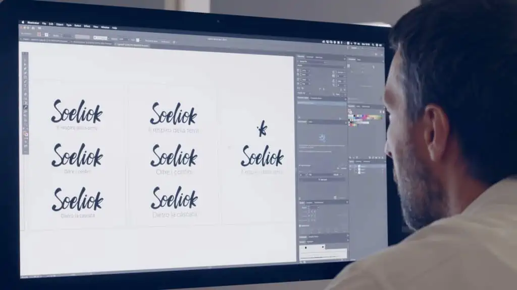
We also wanted a logo that had a typographic part, to give value to the name of the project and an iconographic part to be used as a watermark in all social publications and communications. We therefore concentrated on a lettering that could be perceived as “something written by hand” and that would give us the possibility to isolate the letters -K- and -i- to join them in the iconographic version.
In the evolution of the idea we have also created the animated version that helps to reinforce all these concepts. The Soeliok writing is formed as if a hand were writing it, then the other letters are canceled and the K and the i remain and join up to form the iconographic logo.
Cover
We all know that the cover plays a vital role in the sale of a book.
A good cover must capture the attention and intrigue the public, but at the same time it should somehow summarize the main concepts underlying the novel.
The cover tells many more things than we imagine and whether we want it or not will influence the choice of those who buy.
What hidden information can a cover provide us with?
- The age of the reader to whom it is addressed
- The gender of the reader to whom it is addressed
- The genre of the novel
- The historical or geographical context
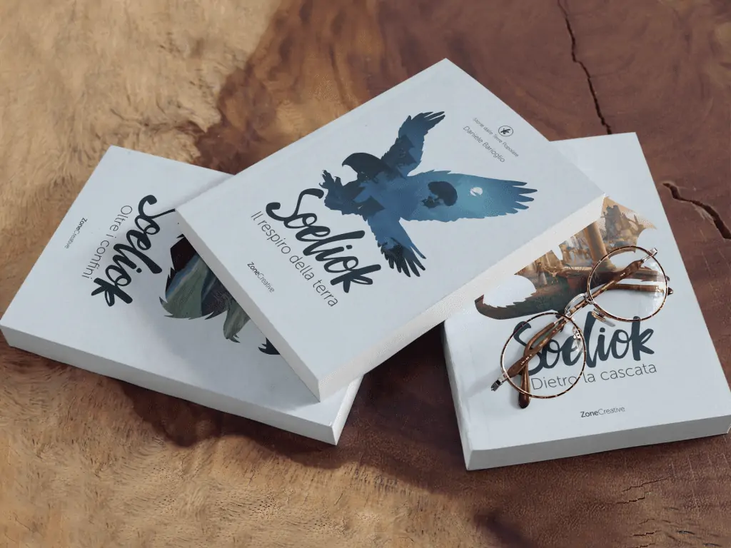
Aware of these aspects, we looked for a captivating cover, in order to intrigue a large audience at first glance, but also elegant and clean, so as not to lower the age of the potential audience too much.
We looked for a unisex aesthetic in shapes and colors (although a slippery debate could open up on this point). As far as the genre of the novel is concerned, we focused more on the idea of adventure than on the word fantasy in a specific way and we preferred to give a glimpse of part of the geographical context, such as the mountains, the cliffs of the North Sea or a city on waterfalls … without ride the usual clichés of the medieval fantasy genre.
Each cover offers a triple reading
- The title of the book
- The shape that encloses the illustration
- The actual illustration
Through these three parallel messages we tried to build three covers that would give the trilogy the right compromise between aesthetics and authority.
Paper edition
For the paper edition of Soeliok, we immediately ran into a fundamental question: hardcover or flexible?
Many fantasy book publishers choose the latter option to make the packaging more attractive and entice the public, but many have pointed out that reading a novel is more enjoyable if you hold a soft and practical book in your hand to carry with you.
However, we did not want to give up the feeling of prestige that gives you a good title on the library. After a careful analysis and a survey done on a sample of 5,000 people we opted for the flexible cover, but with a high quality color print, UV laminated. We’ve also added two 12 cm flaps to enrich the information space and keep printing on the back with Nikolai Lockertsen’s wonderful images.
The three volumes are paperback in 15×21 format and once placed side by side, the spines create a pleasant coordinate.
A choice of character
For the character of the text we opted for the traditional Simonicini Garamond, but despite being one of the most popular choices in Italian publishing, it was by no means a foregone conclusion.
The creative intent to present the novel in a more current and modern way has forced us to explore many other solutions and we had to do several press tests and endless reasoning before reaching the solution of such a “traditional” character.
Convinced that a more recent and not “graceful” font like arial or even a more popular one on the web like Din, were the most suitable choice for our book, we found ourselves making dozens of proofs without ever finding ourselves fully satisfied.
The feeling of incompleteness was always lurking and even in the final versions with the color cover, you could feel the sensation of having a draft in your hands.
Did we really have to give in to our beliefs and accept such a widespread and traditional character? The answer was as simple as it was clear: yes.
The choice fully convinced us when we realized that it was not an exception to the rigorous stylistic choice we had imposed on ourselves, but a confirmation of attention and naturalness. In fact, the Simonicini Garamond is not only an aesthetically pleasing character, but it is a real reference in the use of a narrative text. It is probably something that works at the level of our unconscious, but the habit we have in associating that character with a novel allows us to feel comfortable reading and facilitates the delicate process of immersion in history, so coveted by every author.
Icons
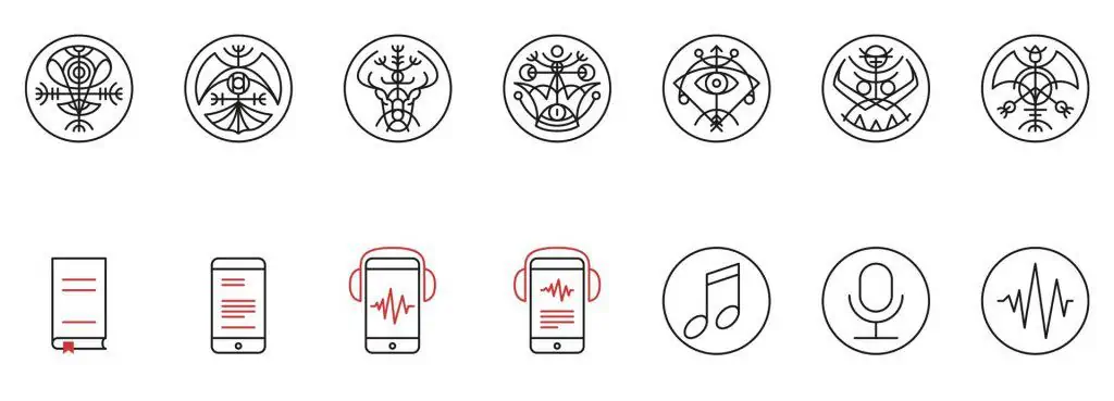
For the global communication of the project, it was necessary to create 3 icon families.
One to identify the 4 types of products:
- paper book
- ebook
- audiobook
One to describe the three audio streams present in the audiobook:
One to summarize the seven civilizations featured in the trilogy:
- the Mountain Dwarfs
- the Plain Dwarfs
- the Indonuim
- the Men
- the Half-elves
- the Orkran
- the Dragons
Also in the realization of these icons we have relied on the solid guidelines established in the initial phase of the project. We therefore sought a clean style, a modern trait in the lines, but with an ancient inspiration in the shape. Some signs refer to the Norse world, to runes, and in general to Nordic symbology. In order to justify a coordinated graphic between the seven icons, it helped us to imagine that it was the civilizations themselves, following the Confederation of Peoples, who created their “official coats of arms”.
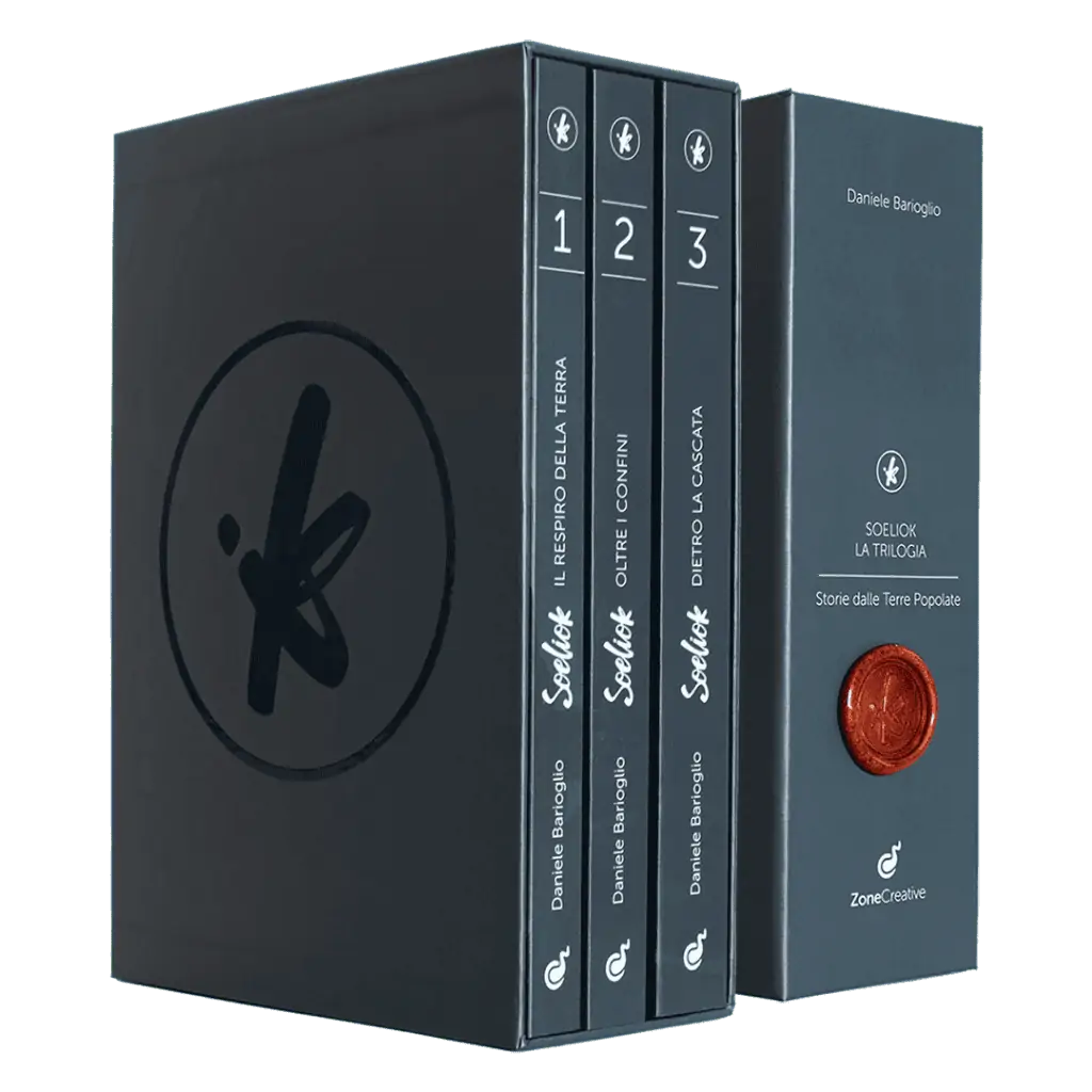
The box set
The box set idea was born to embellish the trilogy proposal during the first Kickstarter campaign. We know that the public who loves fantasy usually appreciates the workmanship of the book, the quality of the printing, the color illustrations and all those devices that help them to make the world in which the novel is set more concrete.
For this reason we have designed the box as a handcrafted product, which would give that feeling of uniqueness and prestige. We have created a simple but functional paper converting project to collect the three volumes, leaving the face that exposes the three backs free. We have chosen a minimal aesthetic so as not to give the product a too commercial flavor, but to enhance that right sense of curiosity and mystery.
After that we gave it further value by adding the soeliok stamp in sealing wax and applying the adhesive label of the Imperial Archives with the unique number of the limited series.
The box set was such a success among the public, that even after the kickstarter campaign was over it was continually requested.
We have therefore decided to make it an integral part of the trilogy and, having created a variant that differs from the limited series, we have made it a “series” product always available directly on the site.
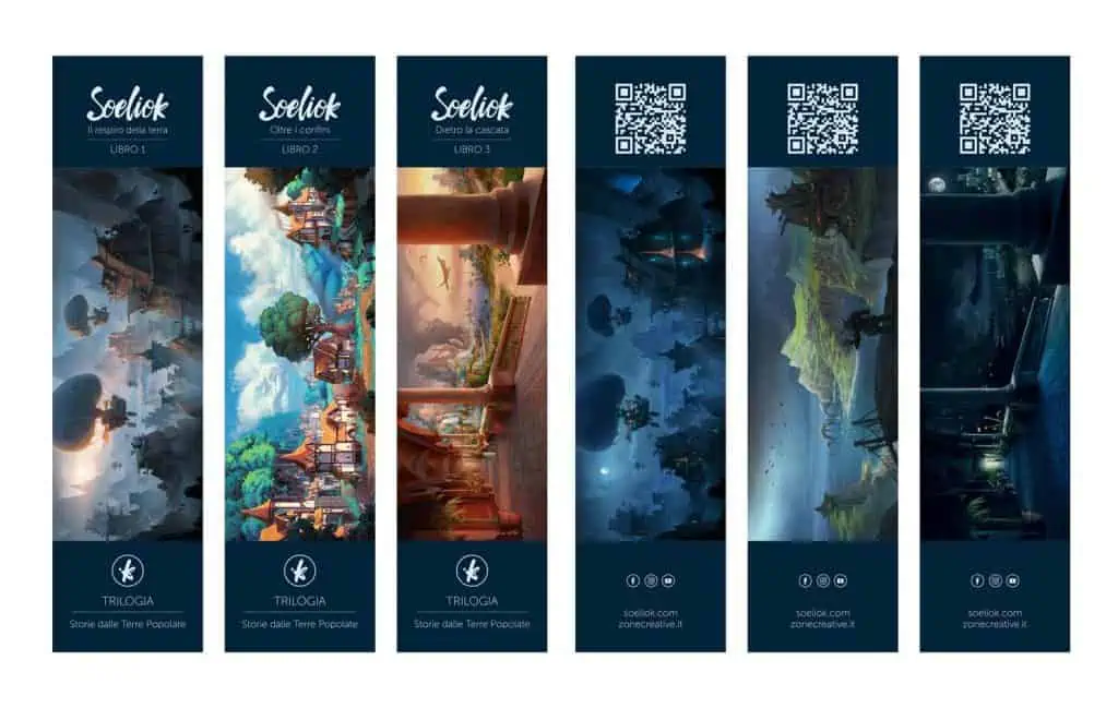
The bookmarks
To complete Soeliok’s graphic project, bookmarks could not be missing. Personally I have always loved these objects; in addition to having a concrete usefulness, they transmit a positive message and invite you to read in general.
Of course we took the opportunity to show off the main illustrations of the three books showing the day version on the front and the night version on the back, always accompanied by a refined text and a QR code linked to the reviews page.
